TAZO Packaging Redesign
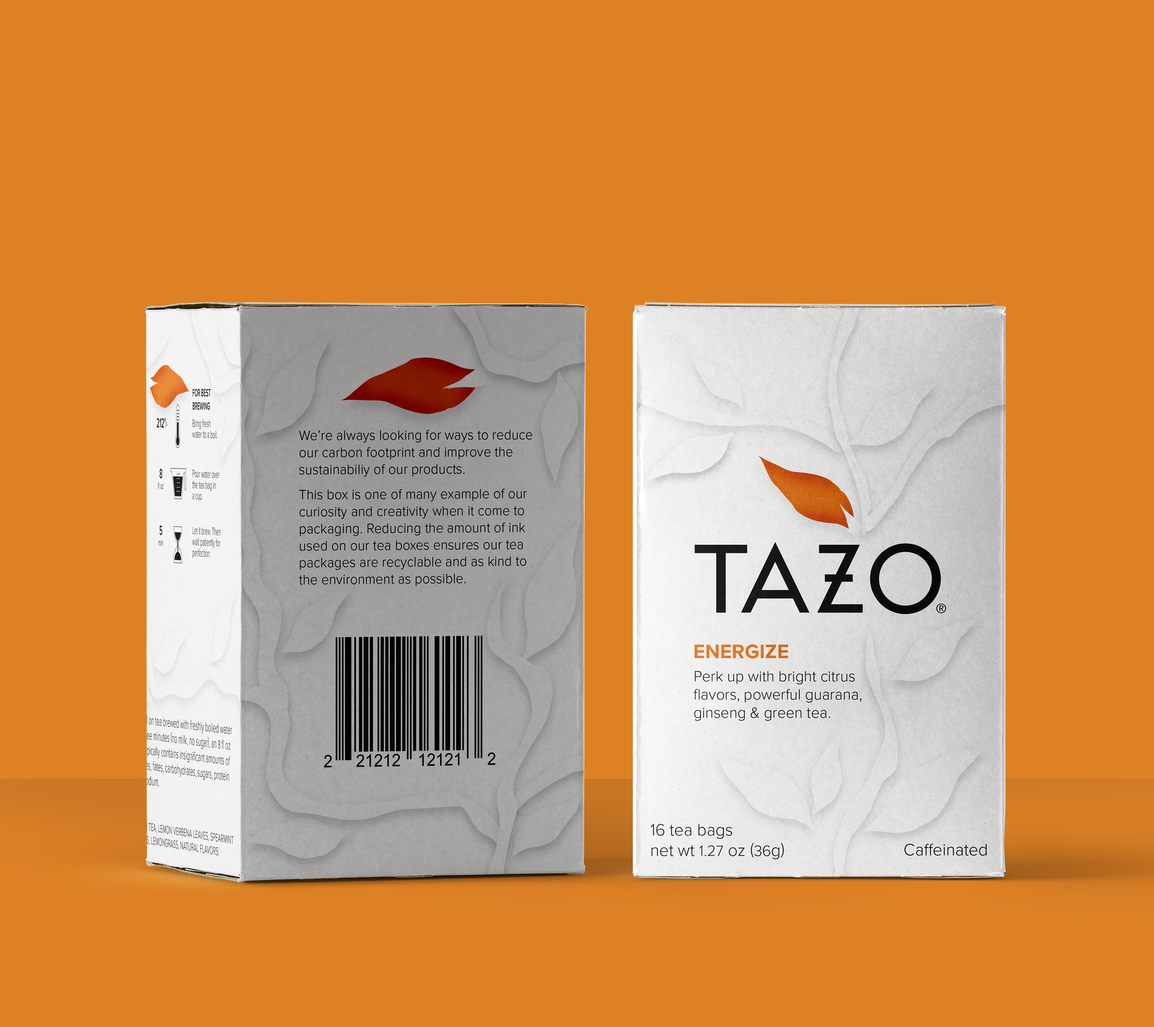
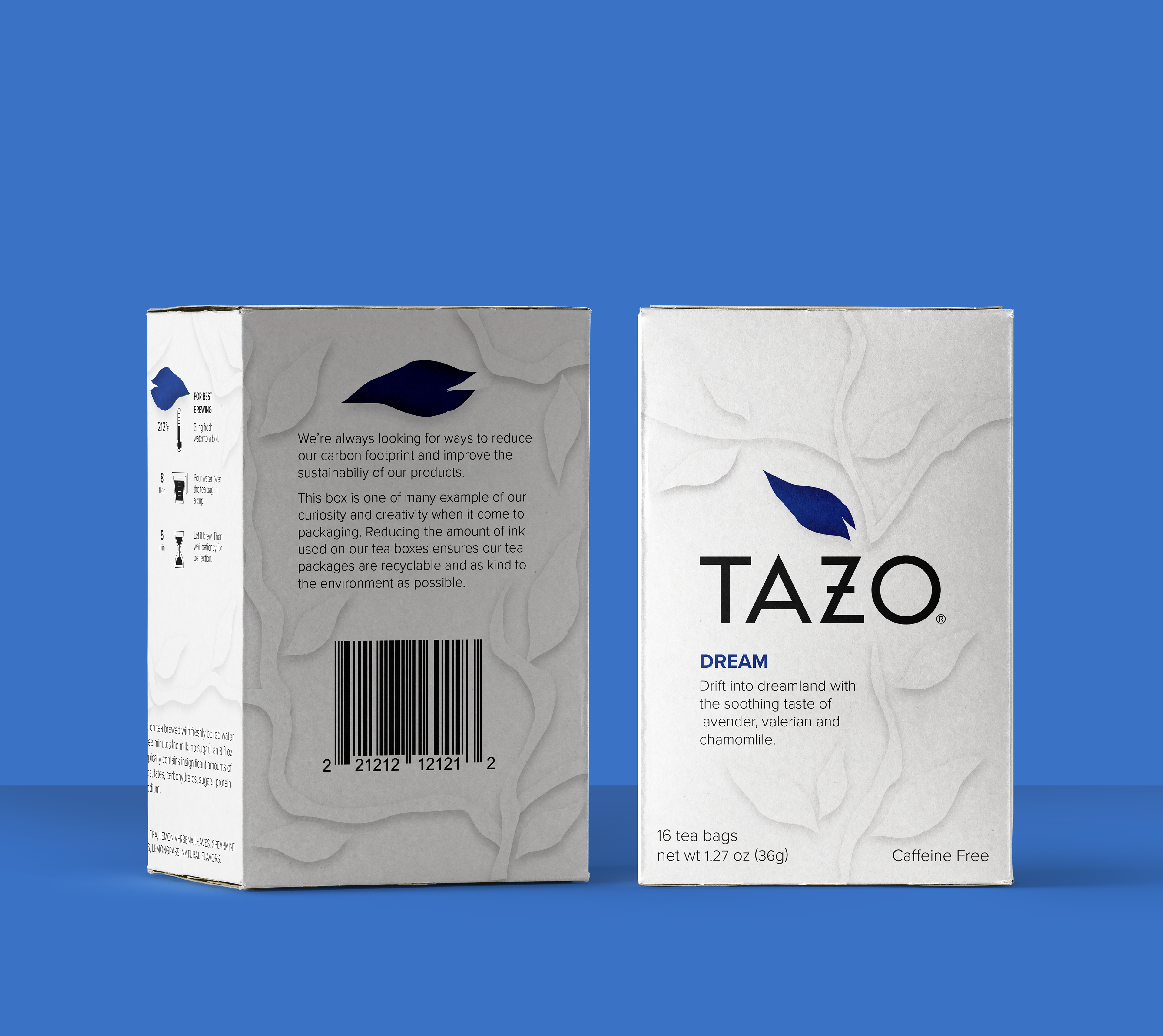
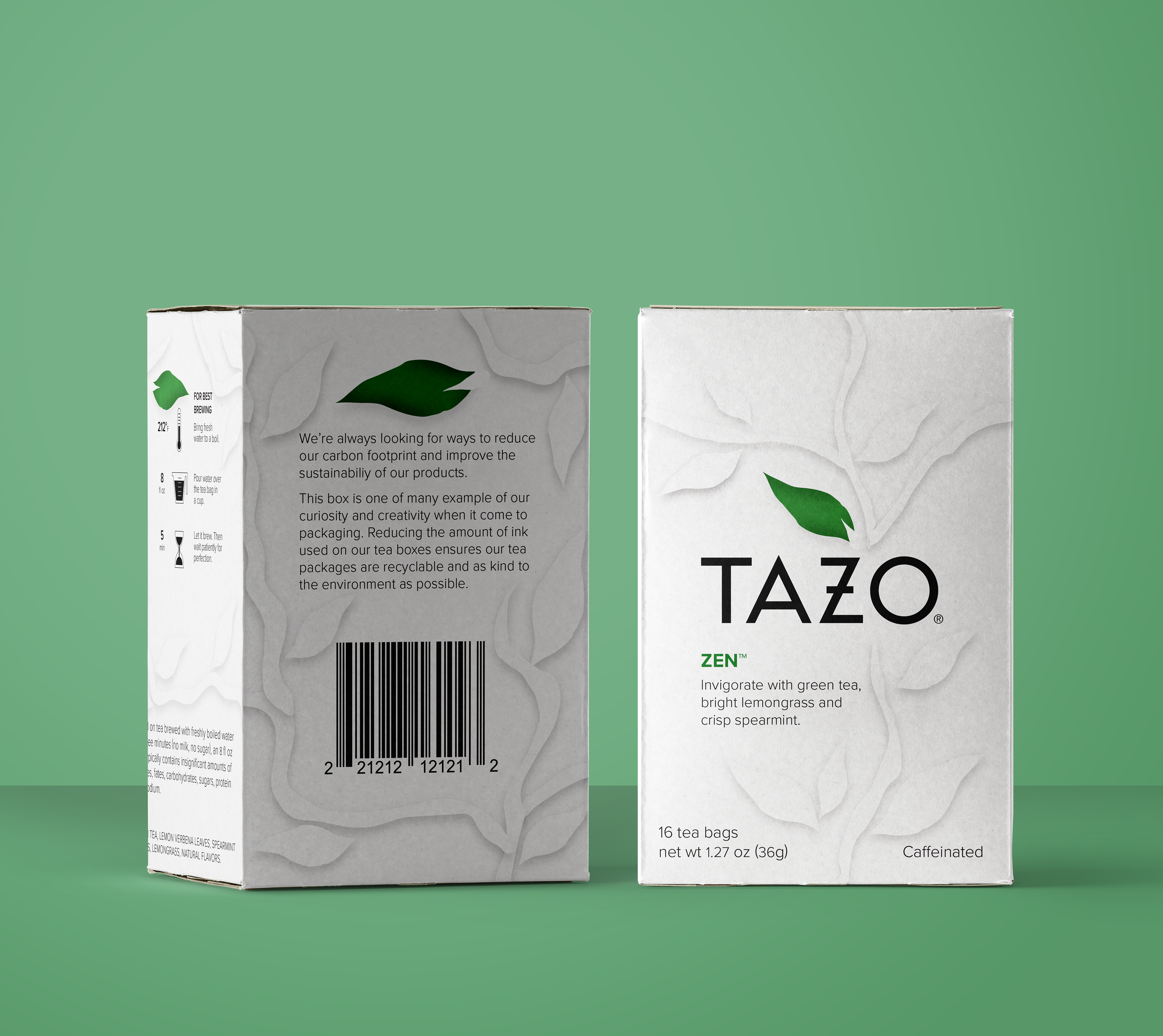
After completing a communication audit for the TAZO tea brand a lapse in environmental consciousness and consumer wellness was identified. This gap became clearer when building a competitor profile on the brands Pukka and Yogi, both of which strongly emphasize the sustainability of their packaging and farming practices as well as the many health benefits provided from their teas. Increasing the sense of care for the planet and the consumer will help TAZO compete with brands like Pukka and Yogi and potentially appeal to new markets. Three initial flavors were chosen accordingly to promote this redesign based on their benefit to consumer wellness. Zen for its invigorating calm, Dream to help with sleep and Energize to brighten and impower the consumer’s day.
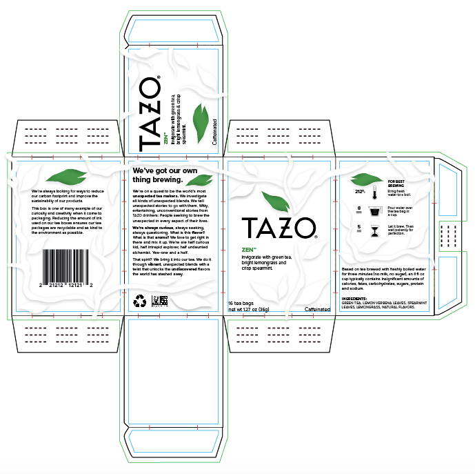
Packaging dieline
Project Goal
This re-design aims to improve packaging sustainability by reducing the amount of ink used on TAZO’s tea boxes, cutting down on the amount of harmful chemicals released when the tea box is recycled or thrown away.
Instead of using ink, the main design and optical interest is created through an intricate embossed tealeaf design. The main use of color is centered on a single tea leaf on each side of the box to indicate and match the flavor of the tea, however the rest of the box uses only black ink for the required text and icons.
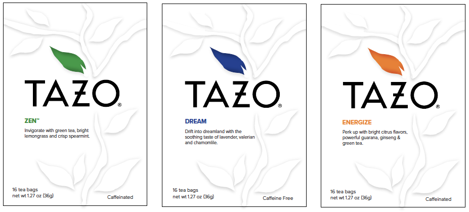
Detail images of packaging fronts together
The stark lack of color and tangible embossed texture helps the packaging stand out and contrast from competitors on the shelf. The re-design will also help improve TAZO’s image of sustainability and consumer care while still maintaining the brand’s emphasis on the unexpected with this uniquely embossed design.